- DATE:
- AUTHOR:
- The Narmi Team
Accounts and Dashboard Redesign: See your financial story at a glance
Narmi has redesigned the accounts and dashboard pages within our digital banking platform. We wanted to create a more elevated experience that better allows users to view the full picture of their finances in just a few seconds.
We spent lots of time researching and testing what pieces within digital banking are the most important, how to present them, and how to make banking accessible for everyone.
What is a dashboard page, and why is it important?
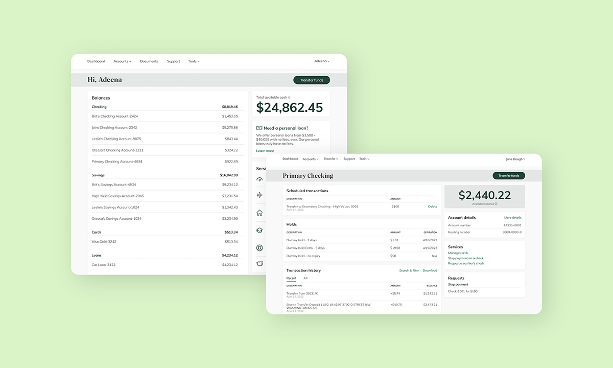
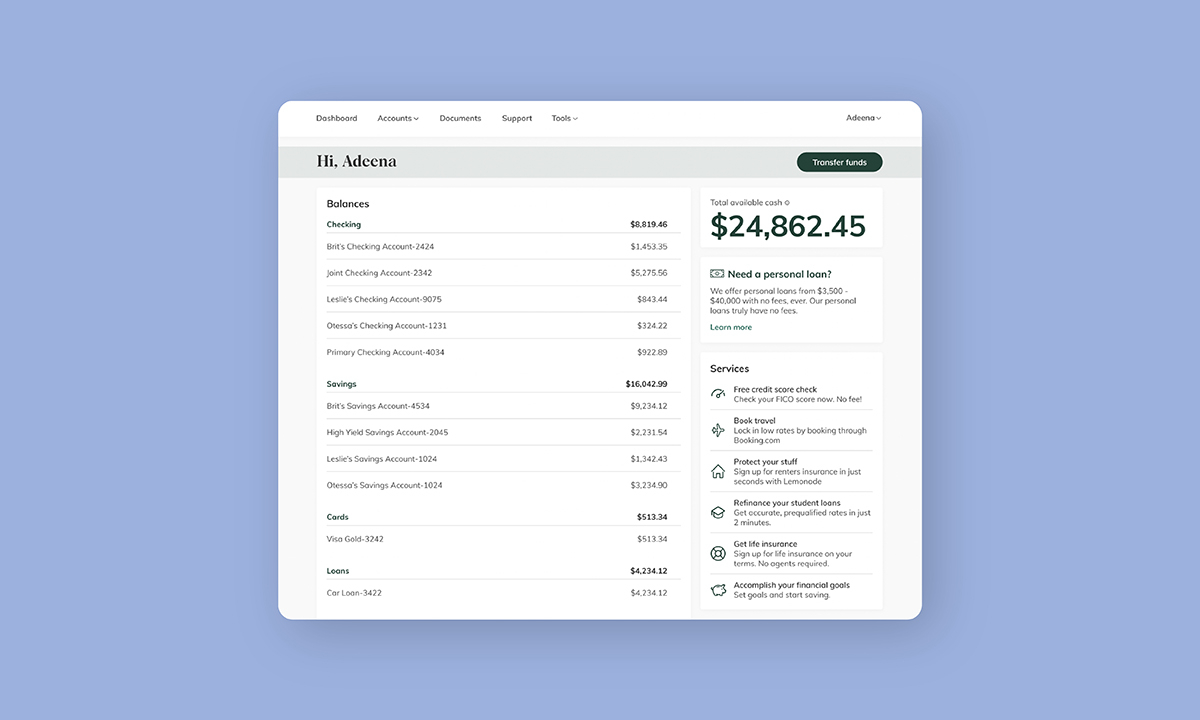
The dashboard page within digital banking displays all of a user’s accounts – from obvious ones like checking and savings, to less obvious accounts like CDs and loans. It’s a one-stop-shop for a user to see their total financial story. Without a dashboard page, the user would need to click into each individual account, review, and add up their balances to understand if their finances are in check. Aggregating all of their accounts in one place helps users manage their money more quickly and efficiently.
What is an accounts page, and why is it important?
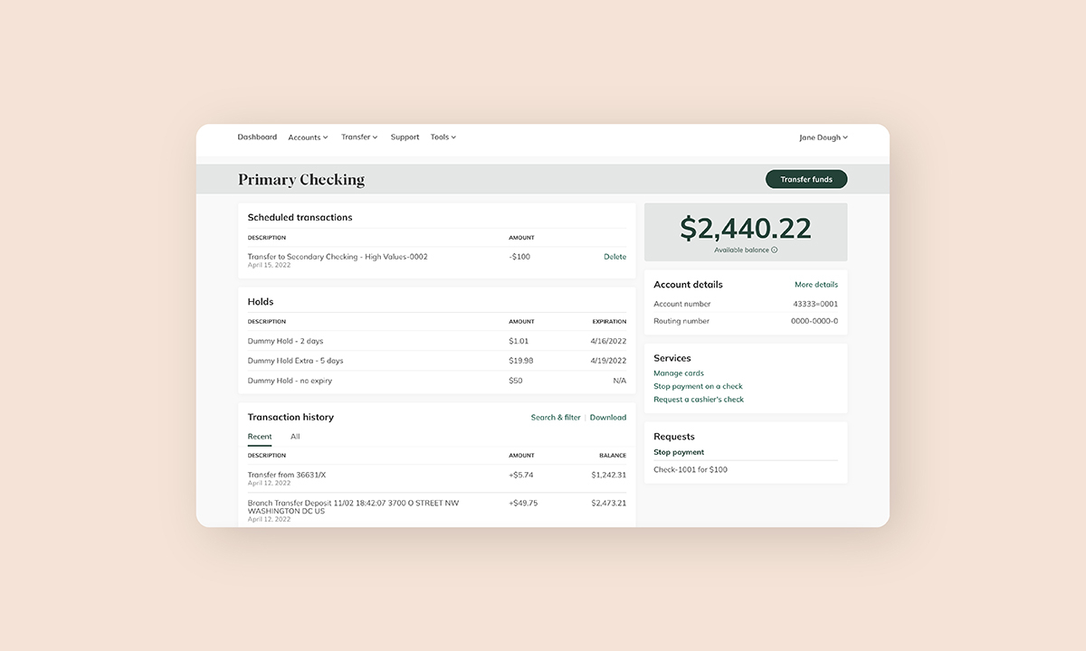
The accounts page allows a user to pull up an individual account and view all the information pertaining to that account at once. It houses account balances, scheduled transactions, recent transactions, and the ability to transfer. This lets the user go more in depth than the dashboard page by displaying all of the activity within a specific account.
Why did we redesign these experiences?
Through research and testing, we uncovered a few areas that we could streamline and improve upon within our digital banking platform. We used those learnings to design a more intuitive experience, with the goal of letting users manage their money in a fresh way – one that is simple to use, easy to understand, and lets users view their finances within seconds.
We centered the redesign around a few key design goals:
🏃 Make it faster and easier for users to find the financial information they need.
The account page consolidates information like transfer history, the ability to transfer funds, transaction history, and total balance, and puts it all in one place.
The redesigned dashboard makes it easy for users to see all of their accounts and funds at a glance, as well as view their recent activity.
The updated navigation is cleaner and simpler, making it easier for people to find what they need.
👀 Give your users more control over what they want to see.
Users can sort their accounts on the dashboard alphabetically, by balance, and account number so that the order fits their needs. From our research, there’s no “one size fits all” when it comes to banking, and allowing for a customized view is the best way to please a broad user base.
The ability to favorite / hide accounts so that users can easily find relevant info and not be distracted by accounts that they don’t use often.
New search options allow users to create very specific searches.
🖼 Enhance the user interface for a more accessible experience.
Our new design system introduces a modern, clean look that tastefully incorporates your FI’s brand colors into the experience.
We’ve made our buttons a consistent color and size, as well as updated the fonts to be a more visually accessible size, leveraging the Narmi Design System.
Check out the two videos below for an in-depth walkthrough of the changes to both the dashboard and accounts page:
Watch a walkthrough of the dashboard redesign here.
Watch a walkthrough of the accounts page redesign here.