- DATE:
- AUTHOR:
- The Narmi Team
Declutter to Direct Focus: Mobile Home Screen
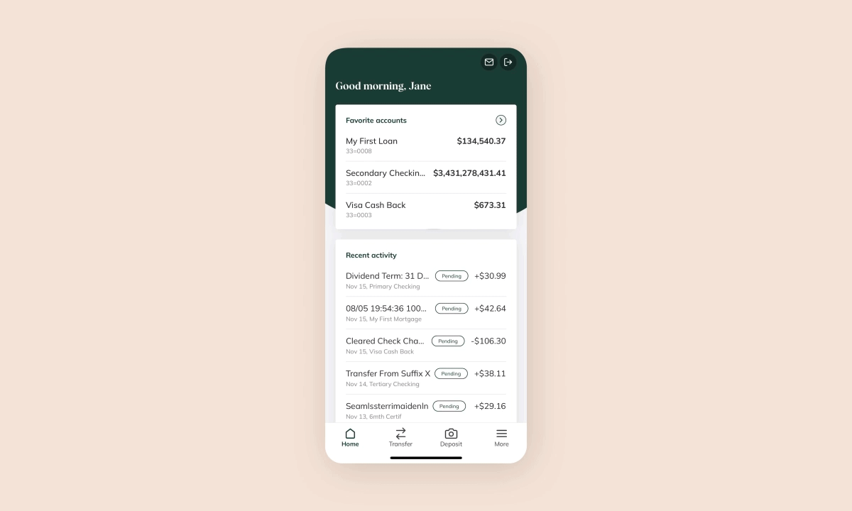
When a user logs into their bank account on mobile, the first place they are directed to is the home screen. It serves as the entry point for navigation and is often the place where users form their first impression of the digital banking experience.
With that importance in mind, Narmi has made a variety of enhancements to the home screen this month. We focused on creating a sleeker and more straightforward user experience that spotlights features that matter most to users.
Why did we enhance the mobile home screen?
Through user testing, we uncovered that users could not find what they were looking for on the home page as quickly as we had hoped. There was a lot of information for users to digest, and some felt overwhelmed by the amount of content on one screen.
We also learned that most users were not scrolling beyond the first few items on the screen which inhibited the discoverability of features at the bottom of the screen.
This made our primary goal clear: to declutter the screen and place only the most important information front and center.
How did we enhance the mobile home screen?
Check out the video walkthrough below for an in-depth look at all the changes! In structuring these enhancements, we followed a few key design principles:
Keep it short and sweet. In an effort to declutter, we had to truly evaluate what information was most useful to display. We simplified the user interface so users can find what they need with ease.
Use carousels to leave a small footprint. Carousels, or a collection of items in a horizontal scroll pattern, have an important advantage on mobile: they fit a lot of content in a dedicated space, with a relatively small footprint. We leveraged this design tactic to fit items of a similar category, like all AppXchange cards, into an assigned space. This not only reduced the amount of vertical scrolling required but also gave users a clear place to go when looking for something.
Zoom in on account-level transactions. In determining what information is most important to users, we unearthed that many of the zoomed-out, big-picture statistics summarizing all accounts were not useful. Instead, users valued seeing specific information on each of their individual accounts, as this helps them better track and understand their spending habits.
Watch the video below where we walk through all the enhancements to the mobile home screen: