- DATE:
- AUTHOR:
- The Narmi Team

Designing for Accessibility: Creating inclusive digital banking
Accessibility, on both web and mobile, is a basic right. In the same way you would install accessibility ramps at the front door of your branch, it is imperative to consider your digital accessibility as well. If someone is unable to access your digital branch due to accessibility, it hinders user experience, and ultimately, revenue growth.
Narmi has made improvements across both consumer and business digital banking that work to make our product more accessible to everyone.
Why do we innovate on accessibility?
Narmi is dedicated to improving accessibility, as it ensures that our digital banking products are available to all people. Nearly 1 in 4 people in the U.S. have a form of disability. That 25% of the population needs to manage their finances safely and securely, with support from their financial institution.
In 2018, 40% of all community banks in the U.S. faced lawsuits for lack of accessibility on their sites, and in five states, 100% of credit unions also faced legal repercussions for the same issue. This means that a significant portion of users can’t get the financial services they need without difficulty – and that shouldn’t be the case. Read more about why Narmi is focused on accessibility here.
How did we improve accessibility?
We made three key changes this month that work towards making our product more accessible for all.
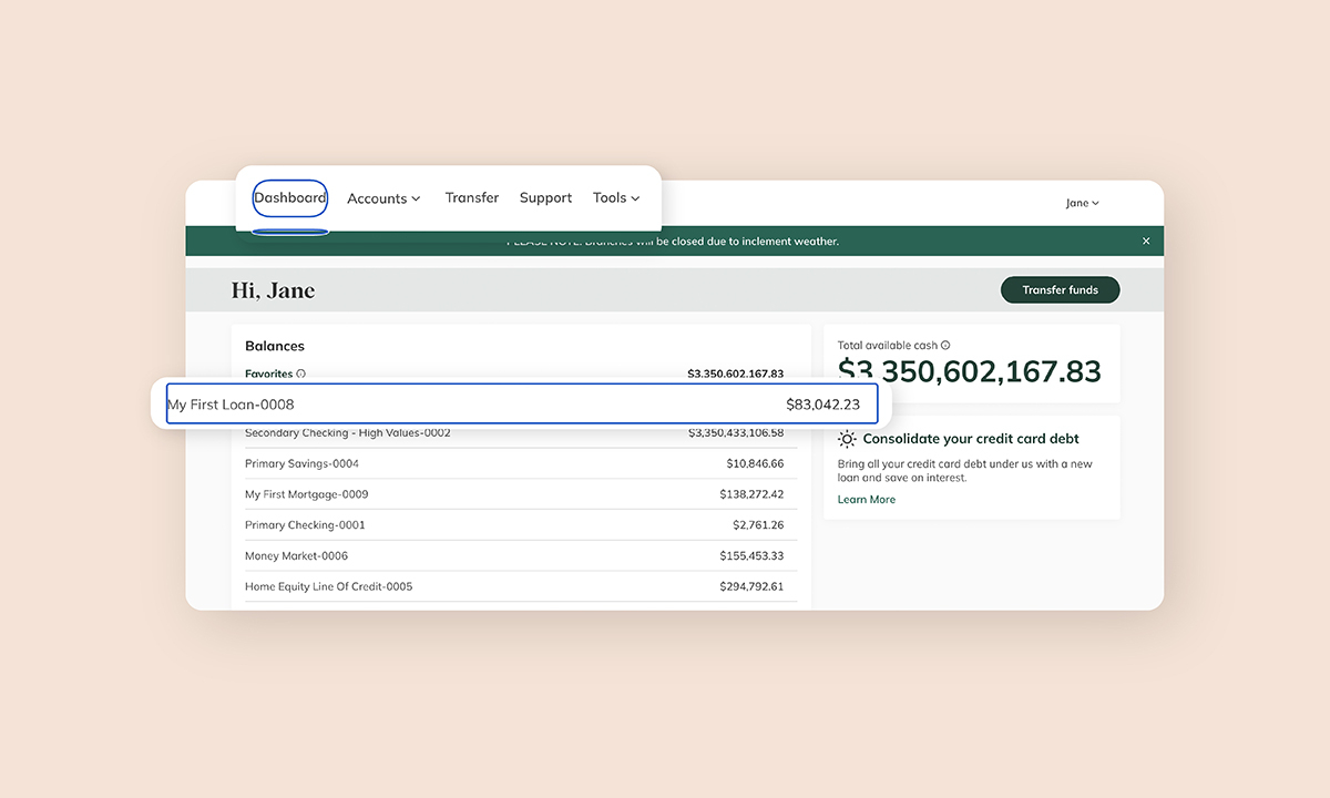
Added “tab key" functionality for navigation.
This is a hidden “Skip to content” button that allows users to navigate through digital banking and the staff portal using only the tab and enter keys. Many users of assistive technologies use a keyboard to interact with a website when they are on a computer, as opposed to a keypad or mouse, so this is a critical step toward making digital banking accessible for them.
See how it works here.

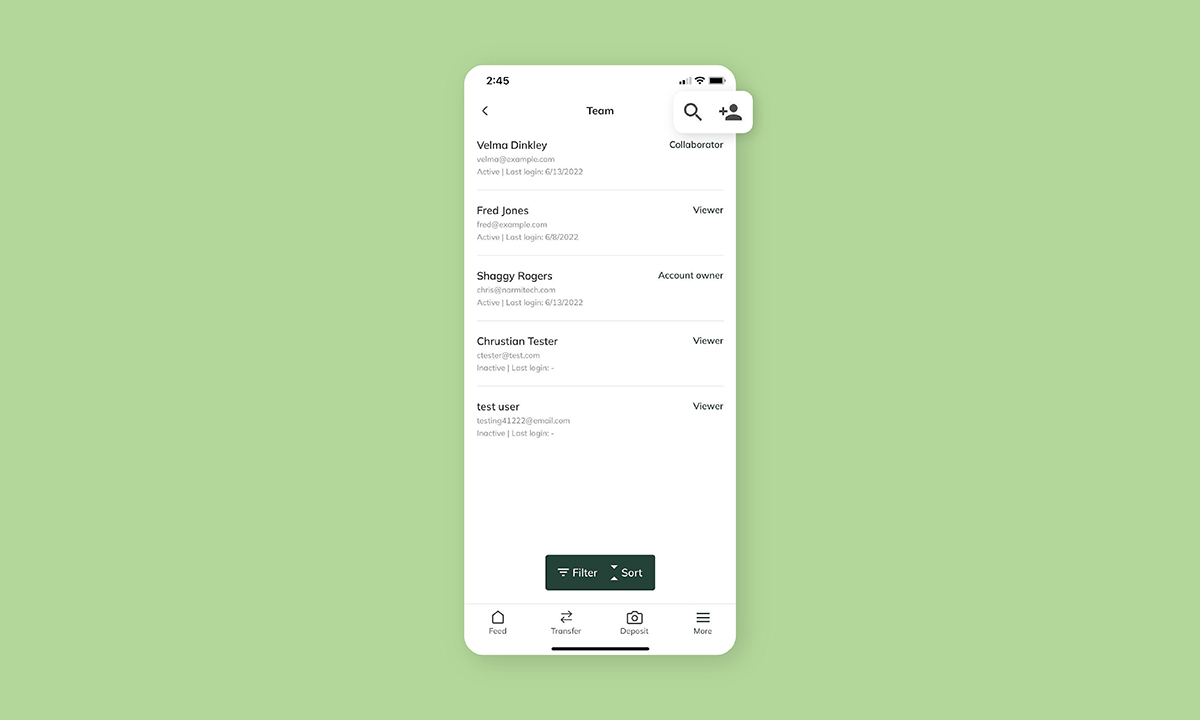
Relocated the “search” and “add user” icons to be more intuitive.
We've shifted the “search” and “add user” icons located within the "Access Manager" to sit in the top right corner of the page within mobile business digital banking (they previously sat on the top left corner). This was partly a visual improvement decision, but it also increases accessibility. Previously, these icons sat very close to the “back” button, so we opted to space them out on the other side in order to avoid any missteps. We also added increased padding between the icons to prevent people from pressing the wrong buttons.

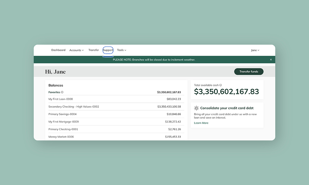
Introduced even more Accessible Rich Internet Applications (ARIA) tags.
ARIA is a set of attributes that you can add to HTML to make content more accessible to those who use assistive technologies or screen readers. We added additional tags to provide screen readers extra information, context, and interactivity with the content on the digital banking pages. These added tags function to improve the overall experience for those using assistive technology.
