- DATE:
- AUTHOR:
- The Narmi Team

Maximizing Staff Efficiency: Narmi's Admin Platform Redesign
Equipping your staff with a powerful digital back-office is essential for helping your financial institution achieve its strategic goals. At Narmi, we are dedicated to providing staff with the tools they need to seamlessly manage both the daily experience of users and the back-end of their institution. This month, we’re excited to share our Admin Platform design refresh that improves the overall user experience, increases staff efficiency, and empowers institutions to take full advantage of Narmi’s product suite.
Here’s what you can expect with this latest update:
 Navigation Improvements

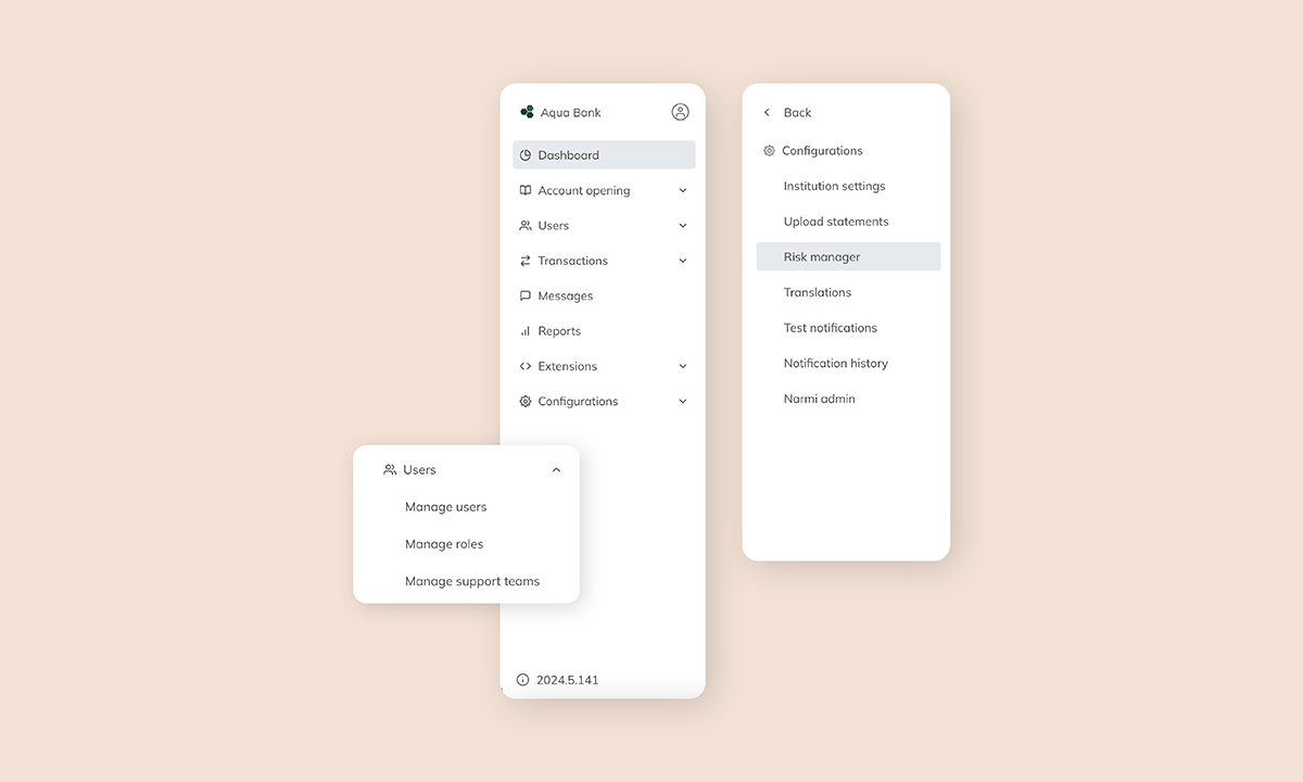
To improve the user experience, we are introducing a new vertical navigation layout. Following UX/UI best practices, we have switched to a vertical layout to group together core workflows and reduce the number of clicks it takes for users to get to their desired page by half.
“A lefthand organizational structure is more scalable because it supports a more complex information architecture. There's just more space available to list out core functionality." - James Nguyen, Narmi Product Designer
The vertical structure allows for a far clearer organizational hierarchy and the opportunity to display more content (data tables, alerts, cards, data visualizations,) above the fold. This ensures that as new features are continuously introduced, the navigation component can scale without disrupting visual patterns that staff are familiar with.
 Staff Efficiency Updates

Increasing staff efficiency on daily tasks allows financial institutions to remain focused on long-term strategic initiatives that drive growth. In designing our new admin navigation experience, we worked closely with our financial institutions to understand what functionality they use daily versus what is only periodically reviewed or updated. Based on these insights, we restructured our information architecture so that the navigation now surfaces tools like transactions and users, while more static information, like institutional and risk management settings, lives in the Configurations tab further down the page.
"A lot of core functions were two clicks away, hidden within a menu - we really wanted to simplify it so these workflows surfaced sooner rather than later, minimizing the number of clicks by half. By organizing products and workflows into buckets, staff members can go directly to things they use most frequently." - James Nguyen, Narmi Product Designer
Our refreshed Admin Platform experience ensures that staff at financial institutions are empowered to take full advantage of Narmi’s continually evolving Admin Platform. Through our new vertical layout and optimized information architecture, staff can efficiently execute and discover new features without disrupting daily workflows.
