- DATE:
- AUTHOR:
- The Narmi Team

Mobile Profile Updates: An Enhanced Editing Experience that Drives Accurate User Records
Digital banking experiences designed for modern life should provide users with the same ease, control, and personalization that they experience with any other cutting-edge tech platform. At Narmi we are dedicated to elevating the digital banking experience by prioritizing beautiful UX/UI, enhancing security, and maintaining feature parity across the mobile and web platforms. This month we’re excited to share a major refresh we’ve made to the mobile profile page that will empower customers to control their personal information and remove staff dependencies.
Here’s what you can expect with this latest update:
 User Experience and Interface Improvements

In order to provide an intuitive user experience, we have revamped our mobile profile tooling to follow patterns that users recognize in other web and mobile applications.
“Consistency really matters in mobile experiences so that a user doesn’t have to learn how to do the same things multiple times.” - Hanna Meltz, Narmi Product Designer
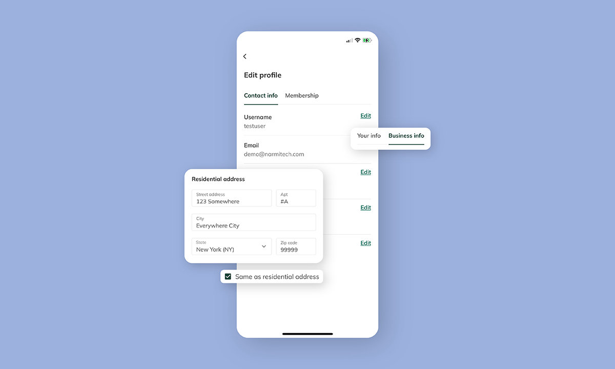
Users will now see a read-only view of their user-information with an edit button on the right-hand side of each field, and only when the user clicks edit and then saves any changes will they be able to update their desired information. Users can now also edit their passwords directly within the “Edit Profile” section of the app. For enhanced security, reusing old passwords is not allowed. We have also enhanced our intelligent form validation so input errors are surfaced to users right away, helping ensure user information is accurate.
 Organizational Improvements

Presenting user information fields in a clear format helps users keep their profile information up to date. In our new mobile profile experience, we separated residential addresses from mailing addresses, so that users have visibility into which addresses they are updating. Alternatively, the user can also check a box if their mailing address is the same as their residential address. These organizational updates will help mitigate any confusion users may have when updating their profile.
 Differentiated Experiences for Business Users and Credit Unions

To ensure that mobile profile tooling meets user needs, we introduced the ability to toggle between user information and membership information for credit unions; and personal and business information for business account holders. The introduction of tabs will help “divide sections and differentiate value” according to Narmi Product Designer, Hanna Meltz. If a credit union user toggles to the “membership” tab, they will now see their account information without having to navigate elsewhere.
For business accounts, we wanted to create a clear delineation between business information versus personal information, so we divided the data into two different tabs. If a user toggles over to the business tab, and has administrative access for their business, they will be able to update their business data. If a user does not have administrative access; they will have a read-only view of their business data and a tool-tip that indicates to contact support to edit the address. This way, regardless of a business user’s role, they will have visibility into their operation’s information and can help maintain accurate records.
